Mostrando entradas con la etiqueta painting. Mostrar todas las entradas

lunes, 21 de enero de 2013

Copia un Van Dyck - Copy a Van Dyck

 
Ejercicio final del curso de Pintura III - copia un retrato de Van Dyck
Óleo sobre lienzo, tamaño A3
Final exercice of Painting III course - copy a portrait by Van Dyck
Oil on canvas, size A3

Aún me falta muuucho por aprender, pero definitivamente estoy contenta con mi avance.  Tengo mil críticas a mi trabajo, tanto en dibujo como en pintura.  Creo que lo que más me llama la atención es el resultado que siempre tira a la ilustración... debo ser ilustradora de corazón jijiji

I still have sooooo much to learn, but I am definitely very happy with what I'm learning.  I have thouthands of critics to my work, both in the drawing and in the painting aspects.  But I thing that what jumps closer to my attention is that my results usually tend to be more illustrative than painterly... there must be an illustrator inside of me... hehehe

El proceso - the process


Final


Mi referencia: pintura original de Van Dyck
My reference:  original Van Dyck's painting


martes, 6 de noviembre de 2012

Fundamentos Visuales III

Hoy no fui a clases (muchas cosas que hacer en casa) ... así que pondré una entrada en mi querido blog.  Esta vez son tres ejercicios de la clase de Fundamentos Visuales III.  El objetivo es generar sensación de varios planos de profundidad usando la temperatura de los parámetros del color (tinte, tono y saturación). 

Quiero agradecer a Cindy Haase (https://www.facebook.com/CynthiaHaaseFineArt, http://cynhaase.blogspot.com/ ) y a Valerie Pye por permitirme usar una de sus pinturas y fotos, respectivamente, como referencia.

Todas las pinturas están hechas con pasteles Faber Castell con fijador, en cartulina Canson 180g A3 (41x29.7cm)


Sensación de profundidad por tinte, cálidos adelante, fríos atrás
Depth by hue, warm colors in the foreground, cold ones in the background
 
Sensación de profundidad por tono, fríos adelante (luz adelante), cálidos atrás (oscuros atrás)*
Depth by tone, cold tones (light values) in the foreground, warm tones (dark values) in the background*

Sensación de profundidad por saturación, cálidos adelante (saturados), fríos atrás (desaturados)*
Depth by saturation, saturated colors in the foreground (warm), desaturated colors in the background (cold)*


I didn't go to class today (too many things to do at home)... so I'm taking advantage of the extra time and posting on my dear blog.  This time it's three excercices for the Visual Fundaments III class.  The goal is to generate the sensation of multiple depth planes using color temperature in the three parameters of color: hue, value or tone, and saturation.  You can see them above.

I would like to thank Cindy Haase (https://www.facebook.com/CynthiaHaaseFineArt, http://cynhaase.blogspot.com/ ) and Valerie Pye for graciously letting me use one of her paintings and photos, respectively, as a reference for the grapes and face pieces above.

All the paintings are made with Faber Castell soft pastels, and fixative, over white Canson 180g paper, 16.4"x 11.88".

domingo, 8 de julio de 2012

Retrato Femenino

Retrato femenino, óleo sobre lienzo, 40 x 50 cm
Woman's portrait, oil on canvas, 16 x 20"


Este es el retrato del que hablaba en mi post anterior.  La señora María me resultó más difícil de pintar, la piel clara no perdona tanto los errores. Lo que sí me gusta de este intento es que logré variedad en los colores dentro de todo. El último retrato que hicimos en clase me salió un poco más monocromático.  Lo pongo la próxima.

Woman's portrait

This is the portrait I mentioned on my last post.  Mrs. Maria turned out to be more difficult to paint, lighter skin tones are less forgiving to painting mistakes. What I like of this intent is that I got somewhat variety in the colors after all. The last portrait we did in class turned out a little bit more monochromatic. I'll post it next time.

lunes, 18 de junio de 2012

Retrato masculino

Retrato - óleo sobre lienzo - 40 x 50 cm
Portrait - oil on canvas - 16 x 20"

Ya casi se acaba el ciclo (mi segundo ciclo en la escuela de arte, de los 10 que forman la carrera) y al fin tengo tiempo de colocar algo más.  En este caso es un retrato que hicimos de un modelo masculino.  Ahora estamos haciendo otro con modelo femenino. ¡Y al fin, terminamos con los bodegones! Resulta que me gusta más hacer retratos que bodegones, quién iba a saber...

La piel está bastante amarilla/naranja porque usamos una luz lateral fuerte de ese color, y al otro lado luz natural fría. Estoy haciendo bastante esfuerzo para conseguir pinceladas más sueltas ... todavía me queda mucho camino por recorrer...


                            ¡Feliz día del Padre, espero que hayan pasado un feliz día ayer todos los que son padres y todos los padres de sus vidas!


Man's Portrait

The semester is almost over (my second at art school from a total of 10 of the whole art career) and I finally have time to post something else.  In this case it's a portrait we did of a masculine model.  Now we're doing a woman's portrait.  And we're finally done with still lives! It turns out that I enjoy more doing portraits than still lives, who would have known...

The skin tone is very yellow/orange because we used a strong lateral light of that color, and a natural colder light on the other side. I'm trying my best to make looser brushstrokes... not still there...

                          Happy Father's Day! I hope those who are dads had a great day yesterday, as well as all the dads of your lives!

sábado, 14 de abril de 2012

Ejercicios de Temperatura de Color


Izq. y der. Cálido y frío por tinte
Left & right Warm and cold by chroma/hue


Arr. y abajo Cálido y frío por tono
Top & bottom Warm and cold by tone


Arr. y abajo Cálido y frío por saturación
Top & bottom Warm and cold by saturation


Izq. Sensación cálida con tintes fríos
Der. Sensación fría con tonos medios y tintes contrastantes
Left Warm sensation with cold hues
Right Cold sensation with middle tones and contrasting hues


Estos ocho ejercicios los hice para la clase de Fundamentos Visuales II, en cartulinas Canson tamaño A4.  Cada ejercicio me tomó entre 6 y 8 horas de trabajo, excepto por el último par que sólo me tomó 4 horas cada uno más o menos (sí, soy muy lenta :) Todos con témpera.


I made these eight exercises for the Visual Fundaments II class, on A4 Canson 180g paper.  Each of them took me between 6 to 8 hours of work, except for the last couple of them which took me only 4 hours each more or less (yes, I'm very slow :)  All are made with tempera. 

viernes, 16 de diciembre de 2011

Bodegón Amarillo

Bodegón Amarillo - Óleo sobre lienzo - 65 x 54 cm
Yellow Still Life - Oil on canvas - 26 x 21.6 "

Este es el último bodegón que hicimos este año en la clase de pintura.  Estoy contenta con el resultado.  Me tomó bastante tiempo terminarlo (el termo de la izquierda solamente me tomó 6 horas).  Esta vez comencé con los objetos y dejé el fondo para el final (algo que supuestamente no debemos hacer, sino todo lo contrario).  Pero quería empezar por la parte "fácil" (se me hace muy difícil pintar esas telas del fondo... lo que he logrado aquí no se parece mucho a las telas reales, sino más bien son una especie de síntesis, y gracias a esto lo terminé más rápido).

Y una pequeña recomendación:  ¡NO manchar con colores oscuros como hice aquí, es casi imposible cubir ese tono con amarillo!

Yellow Still Life

This is the last still life we made at painting class this year. I'm proud of the result. It took me a really long time to finish it (only the hot water carafe on the left took me 6 hours). This time I started with the objects and left the background last (something we're not supposed to do, we're supposed to do the opposite). But I wanted to start with the "easy" part (I find the drapery background too hard... what I have achieved here does not look quite like the real drapery, I kind of "synthesized" it and finished it in almost no time at the end).

One recommendation: DON'T underpaint with dark colors like we did, it's almos impossible to cover with yellow later!!!


Tuve que cubrir todo el fondo con anaranjado para cubrir la mancha oscura
I had to cover everything in the background with orange to cover the dark underpainting

Y luego incluso añadí blanco encima para poder pintar los distintos amarillos...
And later I had to add white all over to be able to add the different yellows...


viernes, 9 de septiembre de 2011

Clases de Pintura - Bodegón en Blanco y Negro


Bodegón en blanco y negro - B/W Still life
Óleo sobre lienzo - 65 x 54 cm - Oil on canvas 26 x 21.6"

Como comentara en mi post anterior, ahora soy alumna libre de cursos de la carrera de arte en una escuela profesional (wow, sonó algo rimbombante...).  En el curso de pintura, hicimos durante casi un mes (9 horas a la semana) este primer ejercicio. Hubo muchas cosas que aprender sobre la luz y las sombras, sobre definición de bordes, etc. etc, cosas que traté de incluir en mi pintura, pero que igual faltaron por falta de experiencia. Pero bueno, igual estoy muy contenta con el resultado.

Ahora estamos haciendo un bodegón con distintos tonos de azul y matices (mezclas) con otros colores. Y está resultando mucho más difícil que este. Dios mediante lo mostraré cuando lo termine.

Painting Class - Black and White Still Life

As I mentioned on my previous post, I'm now an external student of professional courses at an art school (that sounded pretentious... oh well).  In painting class, during almost a whole month (9 hours a week), we made this first exercise.  There were a lot of things to learn about light and shadow, about definition of borders, etc. etc., things that I tried to include in my painting, but that are missing anyway for my lack of experience.  I'm very happy with it anyway...

Now we're making a new still life with different blues and mixes of blue with other colors.  And it is a lot more difficult than the shown here.  I'll be showing it when finished, God willing.

martes, 23 de agosto de 2011

Y ahora con ustedes... The Beatles!


The Beatles
Óleo sobre lienzo - 90 x 70 cm
Oil on canvas - 36 x 28"
Esta pintura la hice hace un par de meses en el taller de pintura al que estaba yendo. Es mi regalo por el día del Padre para mi querido esposo, que es fanático de los Beatles (y de otros músicos también, no se puede negar). Así que, con todo el cariño del mundo, le hice esta pintura.
Tomé una foto de Internet, la modifiqué en la computadora, y luego trabajé con una impresión de esa foto. Así resultó esta versión "pop". A mi esposo le gustó mucho, lo cual, por supuesto, me dejó muy contenta : )
Ahora ya no estoy más en el taller de pintura (que llevé por 4 meses). Ahora estoy inscrita como alumna libre* en dos cursos de la carrera de arte (sí, al fin --> ¡¡¡¡¡¡¡!!!!!!!). Estoy MUY CONTENTA, pero MUY CONTENTA con estos cursos (pintura y fundamentos visuales). Al fin estoy recibiendo la teoría que tanto quería conocer. Recién he empezado. Vamos a ver qué pasa.

And Now with you all... The Beatles!
I made this painting a couple of months ago when I was attending a painting workshop. It is my Father's Day gift for my beloved husband, who is a fan of the Beatles (and of other musicians as well, it can't be denied). So, with all the love of the world, I made this painting for him.
I took a photo from the Internet, I modified it on the computer, and then I worked from a print out. That's the history behind this "pop" version. My husband liked it very much, which, of course, made me very happy : )
Now I'm not attending the painting workshop anymore (I took it for 4 months). Now I am an external student* of two courses of the art career (yes, finally!!!). I am VERY HAPPY, but really VERY HAPPY with these classes (painting and visual fundamentals). I am finally receiving the theory that I wanted so much to know. I have just started. Let's see what happens.
* External student: I am taking only two courses with the kids who are taking the whole art degree (because that's all the time I have, but the idea is to take them progressively, God willing).
* Alumna libre: llevo solo dos cursos con los chicos que están llevando toda la carrera (porque no tengo tiempo, pero la idea es irlos llevando poco a poco Dios mediante).

lunes, 13 de junio de 2011

Ensalada de Naranjas

Óleo sobre lienzo - 15 x 20 cm

Oil on canvas - 6" x 8"


No ha pasado ni un mes y ya estoy haciendo otro post, ¡caramba, como en los viejos tiempos!
Bueno, es que he estado inscrita en "clases de pintura" nuevamente, en otro lugar. En estas clases me divierto mucho, pero no me enseñan nada de lo que quiero (yo quiero aprender teoría, técnicas, y cosas así, pero de eso no me explican nada). A estas clases van alumnos con una foto de un cuadro que les gustó (de Internet casi siempre, y más de una vez de Brito, que está de moda), y con la ayuda del profesor hacen una "réplica". Yo la verdad no le encuentro mucho el gusto a esto, pero en fin, cada uno con su tema. (sí claro, como si yo no hubiera copiado cuadros ajenos antes jeje).
Bueno, este cuadrito es un original por donde se lo mire, pues hasta la foto la saqué yo misma (me inspiré en uno de los retos del sitio Daily Paintworks). Me tomó Dios y su ayuda terminarlo también, he de decir. Y lo dí por terminado pues mi paciencia y desesperación ya no daban más, y como leí por allí, para lograr pintar con calidad, hay que hacer primero mucha cantidad (y bueno, no sé cómo me aplica esto pero igual lo pensé y lo dejé allí, felizmente!).

Orange Salad
It hasn't been a month and I'm posting again; way to go, just like in the old times! :)
Well, it's because I've been attending to "painting classes" again, but now somewhere else. I have a lot of fun in these classes, but I don't really get the instruction I'm looking for (I want to learn theory, painting techniques and things like that, but I don't get that at all). My classmates take pictures of paintings they like to class (from the Internet mostly, and more than once from Brito, who is now 'the chic trend') and with the help of the teacher they do a "replica". I really don't like this very much, but... whatever, everyone has its own ideas (and sure, as if I had never copied somebody else's paintings before.... for the sake of practicing, anyway).
Well, this small painting is an original by its own right, because I even took the source photo myself (I got the inspiration from one of the challenges of the Daily Paintworks site). It took me ages and a lot of work to finish it, I must say. And I called it finished only because my patience and desperation were overwhelming, and as I read somewhere, to achieve quality painting skills you must first paint in quantity (and yeah, I don't know how that applies to me now but I thought of this anyway and left the painting there, thank God!)

sábado, 28 de mayo de 2011

Pequeña pintura mural

Cada figura tiene un diámetro de unos 40 cm
Every figure has a diameter of appx. 15.7"
Así quedó una pared del cuarto de mi hija luego de que terminara de pintarle los Littlest Petshops que quería. Me divertí bastante haciendo este pequeño mural, y fue la primera vez que pinté en la pared de esta manera; a pesar de las pequeñas proporciones, tuve que hacerla de contorsionista varias veces: No es fácil pintar en la pared, mis respetos a los muralistas!
Small wall painting
The above photo shows how one wall of my daughter's bedroom ended after I finished painting the Littlest Petshops that she wanted. I had lots of fun making this wall painting, it was the first time I ever painted this way, and even though it wasn't big, I had to play contortionist many times: it's not easy to paint on a wall, my hat's off for the muralists!
Aquí unas fotitos que fui tomando mientras avanzaba, y en algunas aparece mi ayudante favorita (mi hija preciosa :)
Here are a few photos taken while I was working. My favorite helper (my beautiful daughter :) appears in a couple of them.

viernes, 14 de mayo de 2010

Flores de Durazno

Flores de durazno 03 02

14.5 x 18.5 cm (5.8 x 7.4”)
Lápices de colores en papel Mi-teintes
CPs on mi-teintes paper

Aunque también podrían ser flores de manzana o de ciruela… al menos yo no reconozco la diferencia por las flores :)

Me he demorado más o menos media hora en cada flor, tiempo esparcido en varios días, en varias cortas secuencias por día, en cada momento que tenía libre y en el que tenía ganas de pintar.

Usé papel marrón oscuro, pero no me di cuenta de que no era lo suficientemente oscuro para contrastar bien con las flores, así que al final decidí poner un tono más oscuro para el fondo alrededor de las flores (que viva el sepia!)

Foto de referencia de/Reference photo provided by: Holly Herick

Es mi propuesta para el primer reto de mayo del blog/This is my entry for: Monthly Sketch Project blog

Peach Flowers

They could also be apple or plum flowers… I can’t tell the difference by the flowers :)

It took me approximately half an hour on each flower, time divided through many days, during short sessions each day, every time I had free and was in the mood for painting.

I used dark brown paper, but I didn’t realize that it wasn’t dark enough to make a good contrast with the flowers, so at the end I decided to put a darker color as a background for the flowers (long life to sepia!)

martes, 27 de abril de 2010

Papagayo

Papagayo 02 Papagayo 01 001

Papagayo – Macaw

Lápices de colores Faber Castell CPs, papel/paper Mi-teintes

19x15 cm - 7.6” x 6”


Hay cosas que me resultan más fáciles y que disfruto más (no es que me salgan totalmente bien, pero me SIENTO bien haciéndolos). Los paisajes definitivamente no están en este grupo :) Admiro a las personas que son capaces de simplificarlos y plasmarlos en una pintura.

En la categoría de NO PAISAJES está este papagayo. Aún no lo he terminado, pero lo estoy poniendo porque se acaba el plazo para incluirlo en el segundo reto de Monthly Sketch Project. La foto nuevamente es de ffyrebird, ¡gracias!

Actualización: Bueno, lo terminé. He puesto la foto nueva primero.

Macaw

There are things that I find easier and that I enjoy more (it doesn’t mean that I end up with a master piece, but I FEEL GOOD during the process). Landscapes are definitely not in this group :) I admire people who are able to simplify them and paint them in a painting.

This macaw belongs to the NOT LANDSCAPE category. I haven’t finished it yet, but I’m posting it because today is the due date for the second challenge at the Monthly Sketch Project. The photo belongs to ffyrebird again, thank you!

Update: Well, I’m done. I’ve included the photo first.

miércoles, 14 de abril de 2010

Pagoda Nocturna

Pagoda Nocturna 04 001 Lápices de colores en Mi-teintes negro, 24 x 32 cm
CPs on black Mi-teintes, 9.5 x 13” appx

Este dibujo lo hice para el primer reto de abril del blog Monthly Sketch Project. La foto de referencia es de ffyrebird.

Desde que vi la foto supe que la iba a hacer en papel negro. Hace tiempo que quería volver a pintar en este papel, y la piedra blanca de la pagoda me parecía perfecta para usarlo, bajo la luz de la luna, rodeada de algunas hojas de palmera, y quizás de algunas enigmáticas nubes. Y bueeeno… no salió como lo había imaginado, jejeje, pero ni modo. Me divertí haciéndolo. Recordé poner los colores atmosféricos en las luces reflejadas en la piedra, pero soy malísima para darle uniformidad a los lápices de colores, sobre todo en el fondo, bfff… Y finalmente, no supe cómo resolver el primer plano, la parte del jardín delante de la pagoda… si alguien se apiada y tiene alguna sugerencia, será bienvenid@ (no prometo hacerlo, pero sí considerarlo :)

Night Pagoda

I did this drawing for April’s first challenge of the Monthly Sketch Project blog.  The reference photo is from ffyrebird.

From the moment I saw this photo, I knew I was going to draw it on black paper.  It had been a while that I wanted to use this paper, and the white stone of the pagoda seemed perfect to use it, under the moonlight, surrounded by palm tree leaves, and maybe by some mysterious clouds. And we-e-ell… it didn’t come out as I portrait it in my mind hehe, but what else could I do? I had fun doing it.  I remembered to put the atmospheric colors on the reflected lights on the stone, but I’m really bad at achieving uniformity on the cp’s strokes on the background, *sigh*… And finally, I couldn’t resolve the first plane, the part of the yard in front of the pagoda … if there is someone out there merciful enough to give me any suggestion, it will be very welcome (I don’t promise to actually make it, but to seriously consider it :)

Aquí está el paso a paso/Here’s the step-by-step:

Pagoda Nocturna 01 001 Pagoda Nocturna 02 001 Pagoda Nocturna 03 001 Pagoda Nocturna 04 001

domingo, 14 de marzo de 2010

Visita Familiar

Reunion Familiar

Visitando a la Familia 17 x 9 cm apx
Visiting Family 6.8” x 3.7” appx
LdC Polychromos FC en papel Canson Mi-teintes color marfil
FC Polychromos CP on Canson Mi-teintes ivory paper

Esta semana que los chicos me dejan libres las mañanas, pude aprovechar algunos momentos de cada día para hacer una pintura con lápices de colores. Desde que vi la foto en el blog Monthly Sketch Project me propuse hacerla porque me pareció preciosa y dentro de mis posibilidades técnicas. Esta foto la tomó Gillian Mowbray del blog “The Fading Rose

Hace mucho tiempo que no pintaba con mis queridos lápices de colores y ya los estaba extrañando.

También hice un intento para la foto propuesta en el blog “Una Idea Mucho Arte”, en óleo. Fue tan desastroso que no tengo cara para mostrárselo a nadie. Simplemente la pintura no se entiende. En fin. Estoy muy contenta con mis aliáceas :)

Pasos previos-WIPs:

Reunion Familiar 01

Reunion Familiar 02

Reunion Familiar 03

Reunion Familiar 04

Reunion Familiar 06 Reunion Familiar 09

Reunion Familiar 10

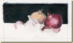
Reunion Familiar 11

Visiting Family

This week I was able to take advantage of a couple of moments every day, during the mornings while the kids were at school, to finish a cp painting. I decided to do it since I saw the reference photo on the Monthly Sketch Project Blog because I found it very beautiful and within my technical abilities. This photo was taken by Gillian Mowbray from the The Fading Rose blog.

It’s been a while since I hadn’t painted with my beloved colored pencils and I was already missing them.

I also gave a try to the photo proposed on the Una Idea Mucho Arte blog (One Idea Lots of Art Blog – under my translation), in oil. It ended up so bad and disastrous that I can’t show it to no-one! The painting is impossible to understand. But whatever. I’m very happy with my Alliaceae :)

Related Posts with Thumbnails