Mostrando entradas con la etiqueta polychromos. Mostrar todas las entradas

viernes, 14 de mayo de 2010

Flores de Durazno

Flores de durazno 03 02

14.5 x 18.5 cm (5.8 x 7.4”)
Lápices de colores en papel Mi-teintes
CPs on mi-teintes paper

Aunque también podrían ser flores de manzana o de ciruela… al menos yo no reconozco la diferencia por las flores :)

Me he demorado más o menos media hora en cada flor, tiempo esparcido en varios días, en varias cortas secuencias por día, en cada momento que tenía libre y en el que tenía ganas de pintar.

Usé papel marrón oscuro, pero no me di cuenta de que no era lo suficientemente oscuro para contrastar bien con las flores, así que al final decidí poner un tono más oscuro para el fondo alrededor de las flores (que viva el sepia!)

Foto de referencia de/Reference photo provided by: Holly Herick

Es mi propuesta para el primer reto de mayo del blog/This is my entry for: Monthly Sketch Project blog

Peach Flowers

They could also be apple or plum flowers… I can’t tell the difference by the flowers :)

It took me approximately half an hour on each flower, time divided through many days, during short sessions each day, every time I had free and was in the mood for painting.

I used dark brown paper, but I didn’t realize that it wasn’t dark enough to make a good contrast with the flowers, so at the end I decided to put a darker color as a background for the flowers (long life to sepia!)

martes, 27 de abril de 2010

Papagayo

Papagayo 02 Papagayo 01 001

Papagayo – Macaw

Lápices de colores Faber Castell CPs, papel/paper Mi-teintes

19x15 cm - 7.6” x 6”


Hay cosas que me resultan más fáciles y que disfruto más (no es que me salgan totalmente bien, pero me SIENTO bien haciéndolos). Los paisajes definitivamente no están en este grupo :) Admiro a las personas que son capaces de simplificarlos y plasmarlos en una pintura.

En la categoría de NO PAISAJES está este papagayo. Aún no lo he terminado, pero lo estoy poniendo porque se acaba el plazo para incluirlo en el segundo reto de Monthly Sketch Project. La foto nuevamente es de ffyrebird, ¡gracias!

Actualización: Bueno, lo terminé. He puesto la foto nueva primero.

Macaw

There are things that I find easier and that I enjoy more (it doesn’t mean that I end up with a master piece, but I FEEL GOOD during the process). Landscapes are definitely not in this group :) I admire people who are able to simplify them and paint them in a painting.

This macaw belongs to the NOT LANDSCAPE category. I haven’t finished it yet, but I’m posting it because today is the due date for the second challenge at the Monthly Sketch Project. The photo belongs to ffyrebird again, thank you!

Update: Well, I’m done. I’ve included the photo first.

miércoles, 14 de abril de 2010

Pagoda Nocturna

Pagoda Nocturna 04 001 Lápices de colores en Mi-teintes negro, 24 x 32 cm
CPs on black Mi-teintes, 9.5 x 13” appx

Este dibujo lo hice para el primer reto de abril del blog Monthly Sketch Project. La foto de referencia es de ffyrebird.

Desde que vi la foto supe que la iba a hacer en papel negro. Hace tiempo que quería volver a pintar en este papel, y la piedra blanca de la pagoda me parecía perfecta para usarlo, bajo la luz de la luna, rodeada de algunas hojas de palmera, y quizás de algunas enigmáticas nubes. Y bueeeno… no salió como lo había imaginado, jejeje, pero ni modo. Me divertí haciéndolo. Recordé poner los colores atmosféricos en las luces reflejadas en la piedra, pero soy malísima para darle uniformidad a los lápices de colores, sobre todo en el fondo, bfff… Y finalmente, no supe cómo resolver el primer plano, la parte del jardín delante de la pagoda… si alguien se apiada y tiene alguna sugerencia, será bienvenid@ (no prometo hacerlo, pero sí considerarlo :)

Night Pagoda

I did this drawing for April’s first challenge of the Monthly Sketch Project blog.  The reference photo is from ffyrebird.

From the moment I saw this photo, I knew I was going to draw it on black paper.  It had been a while that I wanted to use this paper, and the white stone of the pagoda seemed perfect to use it, under the moonlight, surrounded by palm tree leaves, and maybe by some mysterious clouds. And we-e-ell… it didn’t come out as I portrait it in my mind hehe, but what else could I do? I had fun doing it.  I remembered to put the atmospheric colors on the reflected lights on the stone, but I’m really bad at achieving uniformity on the cp’s strokes on the background, *sigh*… And finally, I couldn’t resolve the first plane, the part of the yard in front of the pagoda … if there is someone out there merciful enough to give me any suggestion, it will be very welcome (I don’t promise to actually make it, but to seriously consider it :)

Aquí está el paso a paso/Here’s the step-by-step:

Pagoda Nocturna 01 001 Pagoda Nocturna 02 001 Pagoda Nocturna 03 001 Pagoda Nocturna 04 001

lunes, 29 de marzo de 2010

Paisaje con Lápices de Colores

Final Paisaje Amarillo

Paisaje – Polychromos en papel Mi-Teintes - 11 x 15 cm
Landscape – Polychromos on Mi-Teintes paper – 4.4”x6”

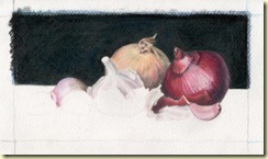
Este paisaje es mi participación en el segundo desafío de este mes del blog Monthly Sketch Project. La foto de referencia es de Raena. Me pareció una foto tan bonita que decidí pintarla, a pesar de que los paisajes no son mi tema favorito. Mi tendencia a poner mucho detalle hace que no disfrute demasiado hacer cosas como esta, en la que los detalles abundan. Creo que por eso me gustan más los acercamientos. No estoy muy contenta con el resultado, para ser sincera. Me he demorado mucho, he hecho muchas correcciones, he recibido consejos (que no he podido usar esta vez), pero la conclusión final es que he aprendido bastante (o al menos eso creo :) ¡Y eso me gusta! Vaya que fue un reto…

01 Paisaje Amarillo 02 Paisaje Amarillo 03 Paisaje Amarillo 04 Paisaje Amarillo 05 Paisaje Amarillo 06 Paisaje Amarillo 07 Paisaje Amarillo 08 Paisaje Amarillo

Colored Pencil Landscape

This landscape is my entry for the second challenge of this month of the Monthly Sketch Project blog. The reference photo is Raena’s. I thought it was such a lovely picture that I decided to paint it anyway, in spite of landscapes not being my favorite subject. My tendency to put too much detail makes me unable to really enjoy when I do stuff like this, where details are abundant. I think that is why I like close-ups better. I am not especially happy with the result, to be honest. It’s taken me too long, I’ve made a lot of corrections, I’ve even received advise (that I couldn’t use this time), but the bottom line is that I have learned a lot (or at least I think so :) And I like that! Wow it was a challenge…

domingo, 14 de marzo de 2010

Visita Familiar

Reunion Familiar

Visitando a la Familia 17 x 9 cm apx
Visiting Family 6.8” x 3.7” appx
LdC Polychromos FC en papel Canson Mi-teintes color marfil
FC Polychromos CP on Canson Mi-teintes ivory paper

Esta semana que los chicos me dejan libres las mañanas, pude aprovechar algunos momentos de cada día para hacer una pintura con lápices de colores. Desde que vi la foto en el blog Monthly Sketch Project me propuse hacerla porque me pareció preciosa y dentro de mis posibilidades técnicas. Esta foto la tomó Gillian Mowbray del blog “The Fading Rose

Hace mucho tiempo que no pintaba con mis queridos lápices de colores y ya los estaba extrañando.

También hice un intento para la foto propuesta en el blog “Una Idea Mucho Arte”, en óleo. Fue tan desastroso que no tengo cara para mostrárselo a nadie. Simplemente la pintura no se entiende. En fin. Estoy muy contenta con mis aliáceas :)

Pasos previos-WIPs:

Reunion Familiar 01

Reunion Familiar 02

Reunion Familiar 03

Reunion Familiar 04

Reunion Familiar 06 Reunion Familiar 09

Reunion Familiar 10

Reunion Familiar 11

Visiting Family

This week I was able to take advantage of a couple of moments every day, during the mornings while the kids were at school, to finish a cp painting. I decided to do it since I saw the reference photo on the Monthly Sketch Project Blog because I found it very beautiful and within my technical abilities. This photo was taken by Gillian Mowbray from the The Fading Rose blog.

It’s been a while since I hadn’t painted with my beloved colored pencils and I was already missing them.

I also gave a try to the photo proposed on the Una Idea Mucho Arte blog (One Idea Lots of Art Blog – under my translation), in oil. It ended up so bad and disastrous that I can’t show it to no-one! The painting is impossible to understand. But whatever. I’m very happy with my Alliaceae :)

martes, 22 de diciembre de 2009

¡Feliz Navidad!

Dibujo Navideño en lápices de colores / Christmas CP OSWOA painting
polychromos, 15 cm x 10 cm (6" x 4")
Queridos amigos. Quiero desearles que pasen una linda y hermosa Navidad, junto con los que ustedes más quieren, sea en persona o en el corazón. Quiero agradecerles también por haber estado conmigo a través de este espacio en este 2009, por haber sido benevolentes y haberme dicho cosas lindas aunque no necesariamente hayan sido merecidas :) Gracias por acompañarme y por hacer que mi experiencia en el ciberespacio, una parte de mi vida, sea más feliz.

¡Los quiero mucho!
Merry Christmas!
Dear friends. I want to wish you have a wonderful Christmas, with the ones you love most, being with them in person or in the heart. I want to thank you as well for having being with me through this blog during 2009, for having being benevolent and having said beautiful things about my art work even when I really didn't deserve it :) Thanks for being there and for making my cyberexperience, a part of my life, a happier one.
I love you!

lunes, 17 de agosto de 2009

Naturaleza Muerta


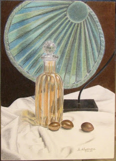
Naturaleza Muerta / Still Life
Lápices de Colores en papel acuarelable/ CPs on watercolor paper


Le dedico este post a mi prima Mitzi, a Keni y a Julio.

En diversos blogs he visto que los artistas pintan lo que tienen en sus casas, cosas comunes y de todos los días. Otros, compran cosas que les gustan especialmente con el fin de pintarlas. Eso para mí fue todo un descubrimiento (es que... no soy muy consumista, creo que si existiera la reencarnación, debo de haber sido hippie en otra época. O quizás simplemente tacaña, y se me quedó :).

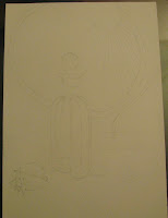
Bueno, la cosa es que me gustó mucho un frasco que vi en una tienda, y gracias a esta inspiración que menciono, terminé comprándolo. También tenía dónde ponerlo. Estuve buscando varias posibilidades para pintarlo, y quería además incluir una de las conchas que estuve pintando hace un tiempo (en el dibujo original se ve que la concha estuvo allí al principio, pero después me di cuenta que no funcionaba la composición).

Y para terminar la composición, no encontraba algo que "me llenara el ojo". Finalmente se me ocurrió incluir unas pepas (semillas) de lúcuma que tengo guardadas por un par de años (quería saber si su lustre permanece o se deteriora con el tiempo: y permanece!). Estéticamente me encantan, y sabía que no iban a ser difíciles de pintar.

Por el contrario, el adorno verde del fondo sabía que me costaría, y dicho y hecho, creo que es lo menos logrado en esta pintura (por lo menos el borde). Quizás si hiciera caso a las cosas que leo y dejara reposar la pintura y con paciencia la corrigiera... pero no, a lo hecho pecho, se acabó, paso la hoja y a seguir adelante. Yo no pinto lo mismo dos veces, no leo el mismo libro dos veces, no veo la misma película dos veces (bueno, las de Disney sí, ni modo)... he dicho!*

*Mentira, eso era antes, ahora me he flexibilizado un poco, pero me provocó tanto poner eso :) Ay! me caigo tan bien cuando estoy de buen humor... qué bueno, porque hoy ha sido un día de esos: perrunos...

PD: Perdón por las fotos. El formato es un poco grande para el scanner y no tuve más opción que tomar fotos (y parece que como fotógrafa me moriría de hambre...)

Still Life
....................

I have seen on a series of blogs that artists paint what they have at home, common and everyday stuff. Others, buy things they like with the special goal of painting them. That was a whole discovery to me (it’s just that… I’m not that into consuming; I think that if reincarnation existed, I must have been a hippie in some other time. Or maybe just cheap, and it stayed with me :)

Well, the thing is I liked a lot a jar I saw at the store, and thanks to this aforementioned inspiration, I ended up buying it. I also had where to put it. I was trying many possibilities to paint it, and I also wanted to include one of the seashells that I have been painting lately (in the original drawing the seashell can be seen at the beginning, but later I realized that it didn’t work in the composition).

And to finish the composition, I didn’t find anything that pleased me. I finally thought of using a few lucuma seeds that I had stored for a couple of years (I wanted to know if they keep/loose luster with time: it stays!). I loved them aesthetically, and I knew they were not going to be difficult to paint.

On the other hand, I knew the green background decoration was going to be tough, and it was. I think it’s the worse part of the painting (or at least it’s edges). Maybe, if I’d follow the things I read and let the painting rest for a while and correct it patiently… but no, what’s done is done, it’s finished, new page and keep going. I don’t paint the same thing twice, I don’t read the same book twice, I don’t watch the same movie twice (well, except for Disney’s, whatever)… period!

*That’s not true, that was true before, now I’m somewhat more flexible, but I couldn’t resist the temptation to include that :) I like myself so much when I’m in a good mood… such a good thing after a not so happy day…

PS: I apologize for the photos. The painting’s size is a little too large for the scanner and I had no choice but to take pictures (and it seems that I would starve to death as a photographer…)


martes, 21 de julio de 2009

Más caracoles en formato ACEO


Caracola dorada - Golden seashell
Caracola en blanco y negro II - Black & White Seashell II
Tarjetas/ACEO aprox. 6.4 cm x 9 cm (2.5" x 3.5")
Lápices de colores sobre papel lienzo - CPs on canvas paper

Me pregunto si alguien ya se dio cuenta de que las fotos de referencia las saqué de la Web... bueno, en todo caso son sólo dibujos por el placer (y la práctica) de hacerlos...

Me fascina el tema de las conchas marinas, y estoy descubriendo lo difíciles que son (para mí) dibujarlas, y más aún, pintarlas. La caracola en blanco y negro que pongo ahora, por ejemplo, la escogí porque pensé que sería fácil terminarla rápidamente, ¡CRASO ERROR!, es el caracol más difícil que he hecho hasta ahora, quizás también se deba a su posición en diagonal (ni frontal ni
de perfil). Y conseguir algo que se parezca al dorado tampoco fue poca cosa.

Pero como me suele pasar, estoy contenta con los resultados, no serán perfectos ni mucho menos, pero es todo lo que puedo dar (por lo menos, por ahora :)

......


I wonder if by now anyone has noticed that the seashells reference photos come from the Internet… well, anyway these are only drawings for the pleasure of making them (and for the practice they involve)…

I am fascinated with the seashells theme, and I am discovering how difficult they are as drawing, and especially, as painting subjects. I chose the black & white shell included now, for example, because I thought it was going to be easy to finish quickly, BIG MISTAKE! It’s the most difficult seashell that I have done so far, maybe because of it’s ‘in diagonal’ position (not frontal, not side view). And achieving something a little bit looking like gold wasn’t peanuts either. But as it usually happens to me, I’m happy with the results. They’re far away from perfect, but that’s all I can give (at least, for now :)

jueves, 16 de julio de 2009

Otro caracol en formato ACEO

Caracola en blanco y negro I - Black & White Seashell I
Tarjeta/ACEO aprox. 6.4 cm x 9 cm (2.5" x 3.5")
Lápices de colores sobre papel lienzo - CPs on canvas paper

Siguiendo con el tema de los caracoles de mar que comencé con otra tarjeta ACEO hace unos días, y un poco para superar la vergüenza del post anterior (jiji), pondremos este dibujillo que terminé hace un par de días.
...
Continuing with the seashell theme that I started a few days ago with another ACEO, and also in order to overcome the embarassment of the previous post (hehe), I'll post this little drawing that I finished a couple of days ago.

lunes, 29 de junio de 2009

Buena Compañía ACEO

"Buena Compañía" (In Good Company)
aprox. 6.4 cm x 9 cm (2.5" x 3.5")
Lápices de colores en papel Tarjeta ACEO, CPs on paper


Esta tarjetita la hice en una hora, más o menos. Tenía ganas de terminar algo, nuevamente. He estado mucho tiempo sin pintar y ya me estaba desesperando. La foto de referencia la saqué de un encarte publicitario de un supermercado, pero el contenido de la copa era originalmente rojo. Lo cambié a verde porque pensé que iba a ser muy monótono todo de rojo. Me gustó la experiencia de pintar el vidrio, si consigo una buena foto de algo de vidrio, voy a volver a intentarlo pronto.

Estaba dejando el fonto en blanco, pero se veía "fatal", el rojo de las cerezas no tenía de dónde salir, se veía totalmente fuera de lugar. Así que, recordando algunas de las cosas que por algo he leído en tantos blogs que visito, le puse algo de rojo al fondo, y funciona mejor (¡en serio! ¡no se imaginan cómo estaba antes!).

Y la conclusión más importante que saco, es que, más difícil que pintar el vidrio, es pintar el contenido, con lápices de color.

........

I finished this ACEO in an hour, approximately. I needed to finish something, once again. It’s been too long since I painted for the last time and I was already feeling desperate to do it again. I took the reference photo from a supermarket flier, but the glass contents was originally red. I changed it to green because I thought it was going to be too monotonous at the end if everything was red. I liked the experience of painting glass, so if I get to find a good photo of something on glass, I’m going to try it again soon.

I was going to leave the background white, but it looked terrible, the red on the cherries had nowhere to come out from, it looked completely out of place. So, remembering some of the things that I have read in one of the very many blogs that I visit, I added red to the it, and it works better (really! You can’t imagine how it was before!)

And the most important conclusion I get is that, it’s easier to paint glass, than to paint its liquid content, with cp’s.

lunes, 22 de junio de 2009

¡Vaya, qué reto!

Verduras Veraniegas (Summer Veggies)
aprox. 24 cm x 9.4 cm (9.4" x 3.7")
lápices de colores fc sobre papel - fc colored pencil on paper
Sí, vaya, qué reto. No pensé que fuera a ser tan difícil, tan es así que no logré llegar a la fecha límite del reto de Karin Jurick y mi pintura no aparece en DSFDF (para la fecha límite apenas tenía los tomates). Ni modo.
Esta entrada la estoy haciendo mientras espero a que mi hija termine su clase de prueba en el ballet (sí, el post original lo hice a mano, en un par de hojas de mi agenda).
Mientras iba pintando, mis emociones iban y venían: "¡Qué lindo me va a salir esta vez!", "¡Oh, no! ya lo arruiné", "No, aún está bien, estoy contenta", "¡¿Por Dios, qué hice ahora!?", y así. Emocionalmente, pintar es agotador para mí. Pero igual me encanta, y luego de olvidarme del último trauma, cada vez vuelvo a entusiasmarme con un nuevo proyecto y comienzo nuevamente con mucha fe en mí. ¡Ay!, qué sería del mundo sin la fe...
Aquí dejo mis nunca bien ponderados pasos previos (con lo que me costó la pinturita, si tuviera 20, ¡igual los pondría todos! ;)


Y Felíz Día del Padre atrasado para todos los que son papás, espero que lo hayan pasado muy bien en su día :)
...
Yes, wow, what a challenge. I didn’t think it was going to be this difficult. So difficult I couldn’t reach Karin Jurick’s deadline and my painting is not shown on DSFDF (at the time of the deadline only the tomatoes part was ready). Oh, well...
I wrote a draft of this post while waiting for the end of my daughter’s today’s ballet class (yes, the original post was ‘hand-made’, on a couple of pages of my agenda).
While I was painting this piece, my emotions were swinging between excitement and deception: “how nice it’s turning out this time!”, “Oh, no! I ruined it!”, “No, it’s still OK, I like it”, “O my God! What did I do!?”, and so on. Painting is emotionally exhausting for me. But still I love to. After forgetting the last trauma, I get the excitement of painting, over and over again, and start once again with lots of faith on myself. What would be our fate without it…?
...And I hope all fathers had a very nice Father's Day celebration last Sunday!
Related Posts with Thumbnails